1 website, 20 minutes, 13 errors - Bugs part 2
This is the 2nd part of my blog about bugs and system errors. If you missed the first part, where I look at issues on a more general level, you can read the blog here. In this blog, on a single website, I’ll give myself 20 minutes to find issues in the user journey or website functionality. The particular website I came across when looking at Christmas gifts.
Lancôme HK website
Lancôme is a brand of one of the largest cosmetics companies in the world, L’oreal. The Luxe group Lancôme is part of contributed more than $US12 billion to L’oreal’s revenue in 2021. I am, in this case, testing their Hong Kong online store in English.
I tested the site functionality briefly with Chrome for about 12 minutes, then tested the site quickly with Edge. Finally, I spent 4 minutes testing using Chrome on Android. Here are the bugs or issues I found in 20 minutes. I also added screenshots to visualize the issues better.
DESKTOP
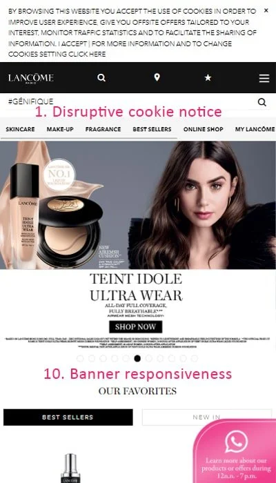
The cookie notice does not have visible buttons and is very disruptive, especially on mobile
The website changes language mid-browsing. Many of the links on the site lead back to the Chinese version of the store, even though an English version of the pages exists
The search suggestions are not working. Even if searching for the most popular products from the brand, there are no suggested products shown
The search does not understand a lack of accents. If you search for “Genifique” instead of “Génifique”, you cannot get results
The search returns a varying number of products depending on the search keyword. For example, under the product line Advanced Génifique, eight products are inside the category. By searching “Advanced Génifique,” you get nine products but if you search “Advanced,” you can only find 7
The chat disrupts your buying journey. If you open a conversation accidentally or want to ask about a product and click to go back, it goes back to the home page instead of the page you were on
An unknown product that is out of stock and has no image is automatically added to the cart when adding enough products. This item is likely some obsolete gift that was given at some point
Products that have only one available size still have a size selector that can be unselected, causing an error message
Sitemap at the bottom of the page leads to a page that has a lot of broken links
The hero banners are not responsive on mobile and contain a lot of too-small-to-read text
Some product names are too long and overlap with other elements on the page
There are two types of product sliders on the site. One is likely native, while the other is perhaps through javascript via a 3rd party system. Why is this an issue? They function and look different, confusing the page functionality and causing the following problem.
Add to bag does not function the same way on all parts of the site, and adding items does not seemingly update the bag contents.
My verdict on Lancôme HK: D+
I did not set out to find a website with many flaws but found quite many quickly. In addition to the above issues, the website had other problems ranging from slow page load times to confusing messages to missing meta information for SEO. Google Page Speed Insights gives the page a terrible ranking for core web vitals, and the page speed gets a score of 43/100 on desktop and 1/100 on mobile. That is right. This is my first time seeing a website score 1/100 on Google Speed Insights.
As it is, the store would get from me a rating of D+. The basics are there, but most areas are buggy, and the shopping journey is highly unfriendly. I estimate Lancôme is losing more than 60% of its potential sales through the website.
Perhaps the website is relatively new, or the market is unimportant. Still, it would be interesting to know what a more thorough, one-day investigation into the site’s usability would reveal.


