5 common website mistakes I constantly encounter
I have worked with many websites, and due to my work, I look at websites differently whenever I enter a new site or store. In this blog, I have compiled 5 of the most common mistakes I see with websites that even big corporations fail at.
Confusing first impression
This is a common mistake in which the page does not effectively communicate where you landed. This can be either due to too little information or too much. Unless you are a company known by everyone, you need to establish what you do and set expectations for visitors regarding what they should find on the page.
In the below example, a local electronics retail chain Broadway has very few elements indicating that they are an electronics store upon landing. Note also that the Chinese banner is shown on the English landing page and that they have 17 slides on their rotating hero banner.
For comparison, Feather and Bone, a deli/butcher, has a very clearly communicated message on their page, telling in a few words and a single picture what they do and what the site is about.


Lack of an SSL certificate
An SSL certificate is a digital certificate that allows secure connections from a web server to a browser. It helps to protect user data, verify website ownership, and prevents malicious attacks. Not having one leaves the site vulnerable to said attacks, and visitor browsers warn them about your site’s vulnerability.
This is an elementary mistake, but even large corporations fail at updating or showing their certificates correctly on their website. When writing this blog, I visited the PCCW website. PCCW is an information and communication technology company with over 20,000 staff and over 2 billion USD in revenue last year. However, when visiting their site, I still get my browser warning me about an insecure connection.
Excessively large images
High-speed internet is accessible by most in developed countries, but mobile internet speeds vary heavily within countries. In the United States, 5G coverage varies between carriers. For T-Mobile, the coverage was 54% in 2022. For AT&T and Verizon, the coverages drop to 30% and 13%, respectively. In 87% of The United States, Verizon users cannot access 5G internet.
When building a website, you want it to load as fast as possible; optimizing your images is crucial. The most common causes of a slow website are unnecessary or heavy scripts, poor connection to the server, and excessive images. The worst offender I have seen was a website with a 14.5Mb 6000x4000 JPG used as a thumbnail measuring only 600 pixels wide. Another website had a logo file that was 300Kb. An average website page size is about 2.2Mb in 2023, so you can imagine how it affects your page load times if you use poorly compressed images.
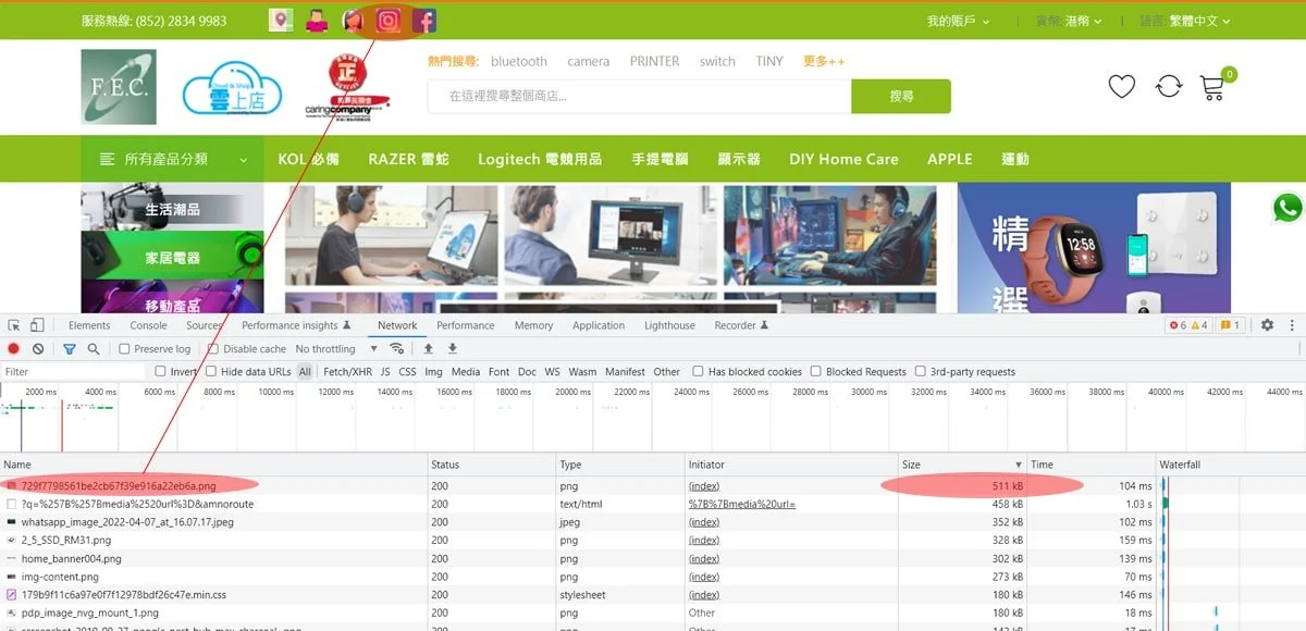
TOOL TIP: In order to check the size of elements on your website, you can either use a tool like Pingdom Speed test or open up the browser console on your Google Chrome by pressing F12 and then choosing the network tab. Then refresh your page by pressing CTRL + F5 so it will ignore any cached content. You can see how long different elements load and identify any elements that take a long time to load or have an excessive size.
Read the previous blog: Why website speed matters - is a slow website killing your conversion
The Foresoon website’s largest element by size is a 511 kB Instagram icon. They could change this to another icon and cut down page size by 7% It is not the only image on the page with a similar issue. Optimizing their images could cut down page load times by 20%.
Broken links
With broken links, I am not only referring to broken links where the target URL is not working. I also mean instances where the link does not follow logic or lead to a page you would expect. These include links with missing parameters that cause a change in language mid-journey or links that cause you to end up somewhere you did not expect. Good examples can be seen in my previous blog about the Lancôme HK website, which you can find here: 1 website, 20 minutes, 13 errors
Messy styling
Perhaps the most common issue with sites I have encountered has been website styling, typography, and colors. Many people choose fonts they like or colors they think are nice without considering how they look for a visitor on the website. This leads to poorly contrasting text paragraphs that are difficult to read and a messy impression caused by too many colors and fonts present. In the below example, Fortress has a clear and easy-to-read font, but the product pages have unnecessary colors and elements and different font sizes, causing the whole experience to feel confusing. It does not help that some elements get cropped by the side margins.
Website styling tips
Choose a color theme and stick to it
Utilize highlight colors only in the important parts of the sites, like Call To Action buttons
Consider the contrast and readability of elements
Avoid having too many font sizes, weights, and colors present on the page
Choose a font that is easy to read
Make sure the fonts are large enough to view even on mobile. A good rule of thumb is to avoid font sizes below 14px
TOOL TIP: Test the accessibility using Chrome browser’s console and the lighthouse report


